Color takes over our world. We ask people why they feel blue and call them yellow when they’re scared; we see red when we’re angry and turn green with envy. We mix, match, coordinate, blend, and pop colors in both our clothes and our homes. Color lets us express ourselves.
Each year, companies seek to find that one color, or palette of colors, that will help to define what that year will mean to the world. Here’s a look at what a few companies have chosen for 2016.

Pantone
As Pantone’s team began researching trends and discovering what people were looking for in color, it was clear the company wanted to choose two hues. According to Leatrice Eiseman, executive director of Pantone’s Color Institute, 2016's Rose Quartz and Serenity not only “bolster” each other, but also work together to create a sense of calm in an ever-changing time. People are experimenting with color and blurring the lines between what colors are considered feminine or masculine; Pantone wanted its colors to reflect that blur.
Design Tips: Eiseman says that the blend of the "tranquil" blue and the "nurturing" pink pair would do well in a bedroom and create an inviting space for relaxation and rest. Alternatively, use Rose Quartz or Serenity on a kitchen wall or on cabinets to give a unique pop of color to the heart of your home.
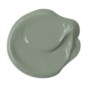
PPG Paints
PPG Paints’ 26 color experts comb through world trends and events before choosing the color of the year. The color for 2016, Paradise Found, is a green with slight blue tones. PPG found this color in nature, fashion trends, and the military. Paradise Found is “reflective of strength, security, and safety in a very unpredictable world,” say Misty Yeomans and Dee Schlotter of PPG Architectural Coatings.
Design Tips: PPG says that Paradise Found is great for any room in the home. But, Yeomans and Schlotter suggest “[repeating] a color at least twice in your room for a professional look, like repeating a wall color throughout the décor items, or using the color multiple times throughout your décor and use a different color for your walls.”
Benjamin Moore
“[White’s] not only fresh, but it’s a story that’s never been told before,” says Hannah Yeo, a Benjamin Moore color and design expert. The company’s team of eight experts chose Simply White for its color of the year after looking through Benjamin Moore’s 250 different shades of white. Simply White stayed fairly constant in the various lights the company tested, and the experts felt that this white has warm undertones that keep it from being too stark.
Design Tips: Simply White is the most neutral white the company offers, Yeo says. It combines well with many colors and works with any style. Experiment with layering whites or combining whites and different colors. “Let white be the hero,” Yeo says.
Sherwin-Williams
Sherwin-Williams’s seven-member team looks to global color trends, WGSN, fashion, media, and many other sources to find its color of the year. Sherwin-Williams chose Alabaster as its 2016 color because “it represents a straightforward and necessary shift to mindfulness, well-being and an atmosphere that is pure and simple,” says Sue Wadden, Sherwin-Williams’s director of color marketing.
Design Tips: The “alluring” white of Alabaster is good in any room. The versatile shade lends itself well to any style and any part of interior space. And for those of you who don't want to change paint colors or themes regularly, fear not; "Alabaster is timeless," says Wadden.

Behr
Behr never chooses one or two colors for its colors of the year; it chooses 20! The company reviews multiples avenues such as culture, consumer shopping habits, consumer preferences, DIY trends, and art exhibits when looking for its palette for the year. Then, the team chooses 20 all-new colors for the Behr brand that will represent the year.
Design Tips: Behr’s colors are broken into four palettes: High Contrast, Luxe Dimensions, Blurred Boundaries, and Lyrical Living. Each of these palettes has its own story to tell, says Erika Woelfel, Behr VP of color marketing, and you can incorporate one palette into the home or mix and match all 20 colors. Customers are encouraged to put colors together in new ways and use the hues that are pleasing to them.
Want more inspiration? Look through the slideshow below to see how you can use the above colors in your designs.
2016 Colors in Design
View All 8 Photos
Let the design suggestions from color and paint companies inspire you to use the 2016 colors in your own space
Play slideshow